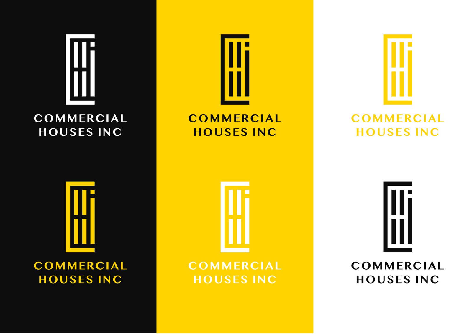
Vibrancy in Hues: Crafting C.H.I’s Distinctive Color Palette
At the heart of C.H.I’s visual identity, the predominant color is a resplendent yellow—a hue synonymous with the sun’s radiant warmth and the uplifting embrace of sunshine. Yellow, in all its variations, embodies a spectrum of emotions, invoking feelings of clarity, optimism, and lightness. It serves as a beacon of positivity, symbolizing warmth and a vibrant outlook.
Yellow’s Diverse Expressions:
Beyond its sunlit connotations, yellow carries a multifaceted character. It speaks the language of creativity and vitality, infusing energy into every facet of our brand. The color’s versatility allows it to signify loyalty, energy, and clarity, thereby accentuating the robust qualities of the C.H.I brand.
Myanmar MN Font: Elegance Redefined:
In the realm of typography, C.H.I employs the Myanmar MN font—a stylized stencil font that seamlessly blends classic TIPO TI aesthetics with an inherent elegance, adding allure to any design it graces. The font’s lines are delicately drawn, embodying a refined charm.
Intricate Font Dynamics:
Myanmar MN script goes beyond the conventional, featuring a myriad of alternate character shapes and ligatures. This diversity allows for a unique play of static discreati, elevating the overall sophistication of our brand.
In essence, our color palette and font selection are carefully curated elements that encapsulate the essence of C.H.I—radiating warmth, positivity, and an unmistakable touch of elegance in every visual representation.


